
Faceted search augments traditional search techniques with a faceted navigation system, allowing users to narrow down search results by applying multiple filters based on faceted classification of items (Wikipedia). In the last two decades faceted search has become a staple of web-based user interfaces to digital cultural heritage collections.
This post looks at faceted search interfaces to several major collections, including the Metropolitan Museum of Art and the Museum at FIT, and documents the process of bringing the Paradicms work-search app up to par with other digital collection interfaces.
Facets and filters
Most digital collection interfaces are work-centric, and allow users to filter on faceted metadata about a work. Filters can be used to refine the results of a full-text search, or filters can be applied to the entire contents of a database.
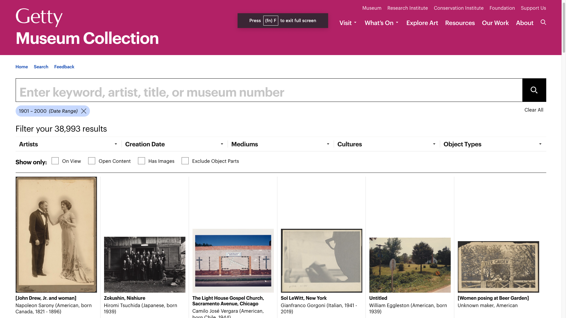
The set of available filters often includes date ranges for a work's creation, a hierarchy of geographical regions, and/or enumerated lists of people associated with works in the collection, as shown in the screenshot of the Getty's collection interface, below.
More specialized collections may provide correspondingly specialized filters on metadata. For example, a digital costume collection may have metadata about the materials and techniques used in the construction of a work.
The Paradicms work search app
The Paradicms work search app provides a faceted and fulltext search interface over the set of works in a digital collection. The app can be configured to facetize, filter, and search arbitrary domain-specific properties of works, such as the condition of a garment.
The work search app has similar functionality to other faceted search interfaces:
- The navbar contains a search box for fulltext search. If the user doesn't enter a query, the faceted search interface starts from all works in the collection.
- Filters for various user-defined properties are shown in an inline sidebar, with an accordion that ensures that only one filter is visible at a time.
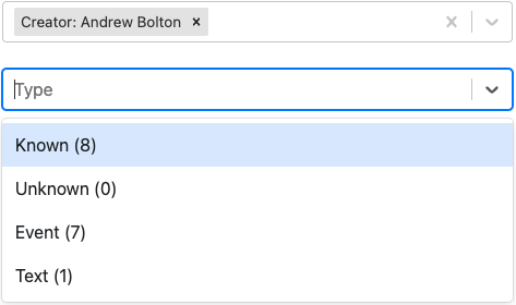
- There is only one type of filter, on values. A value filter is modified by checking and unchecking rows in a table of facet values. The first row is always "Unknown", indicating works that do not have a value for the associated property.
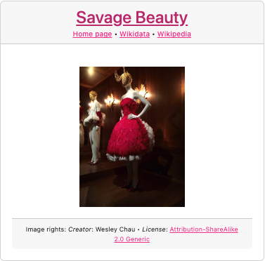
- Works are displayed in a gallery of cards. Each card contains the work title, references to pages associated with the work, an image, and attribution for the image. Image attribution is included by default, since the app does not assume that the owner of the site also owns the image rights. This is a point of divergence from most digital collections, like the ones at the Met and the Museum at FIT, which own the rights to the images they display and don't have to include attribution.
- The gallery has standard pagination and a sort dropdown with common options.
Existing digital collection interfaces
Many excellent examples of digital collection interfaces are available online. The sections below show the faceted search interfaces to a few well-known collections of historic garments.
The Metropolitan Museum of Art
The Met provides a uniform interface to its entire collection. The Met's interface is representative of the state of the art for museums, and includes:
- a fulltext search bar at the top of the page, with dropdown options for searching all fields in the collection database or a subset of them
- an inline filters panel with compact select boxes that autocomplete from large enumerated lists
- a few special filters (Highlights, Artworks With Image, et al.) broken out as checkboxes
- badges indicating the set of currently-applied filters
- a dropdown for selecting different sort fields and orders
- minimal information about each search result (work): image, title, origin, and approximate dates
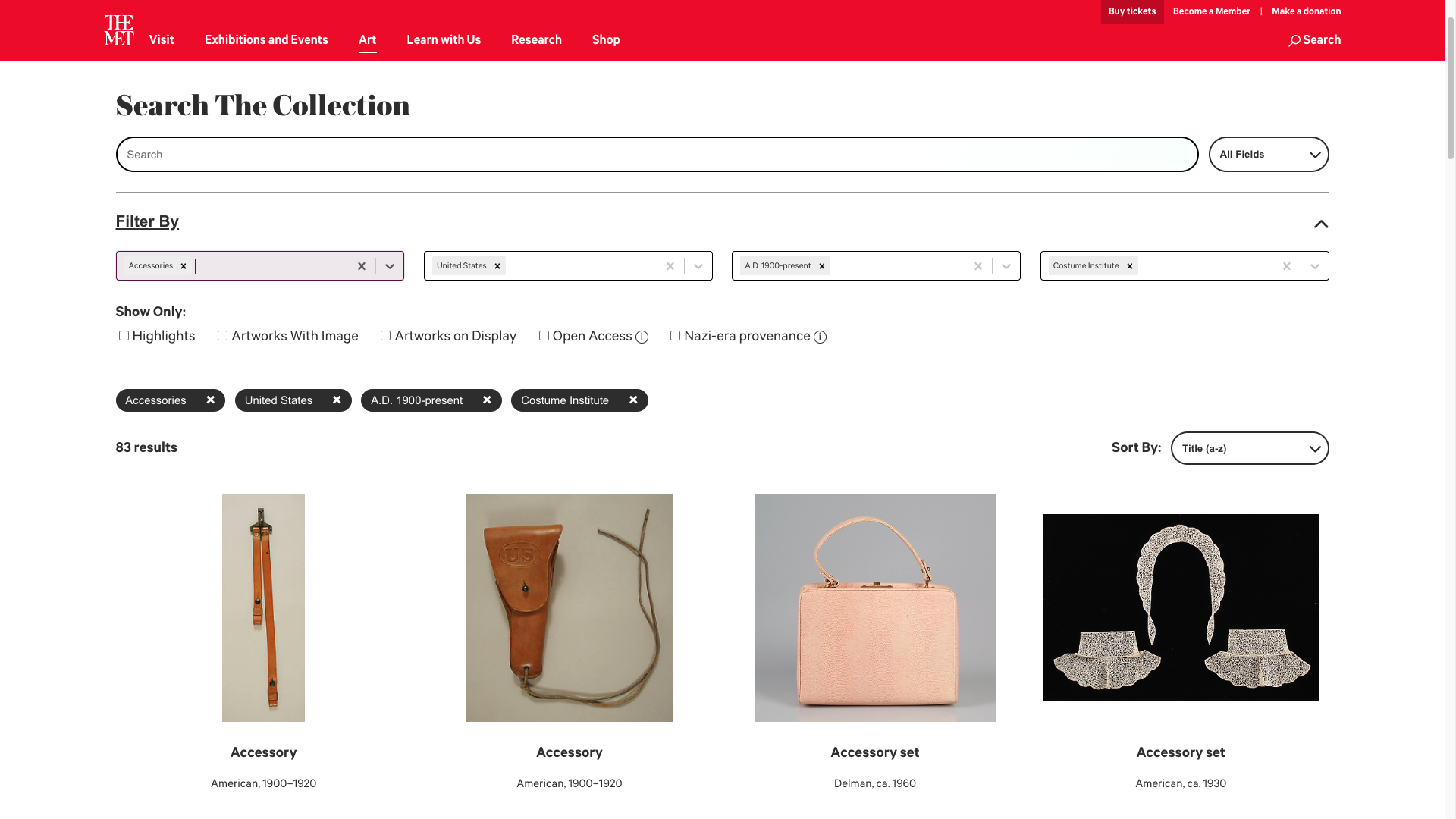
The screenshot shows the works in the Met's collections filtered by type (Accessories), geographical region (United States), date range (A.D. 1900-present), and department (Costume Institute).
The Museum at FIT
The Museum @ FIT's collection interface invites the user to select a subset of works ("collections") before seeing any of them. Alternatively, the user can view all works in the museum's collection.
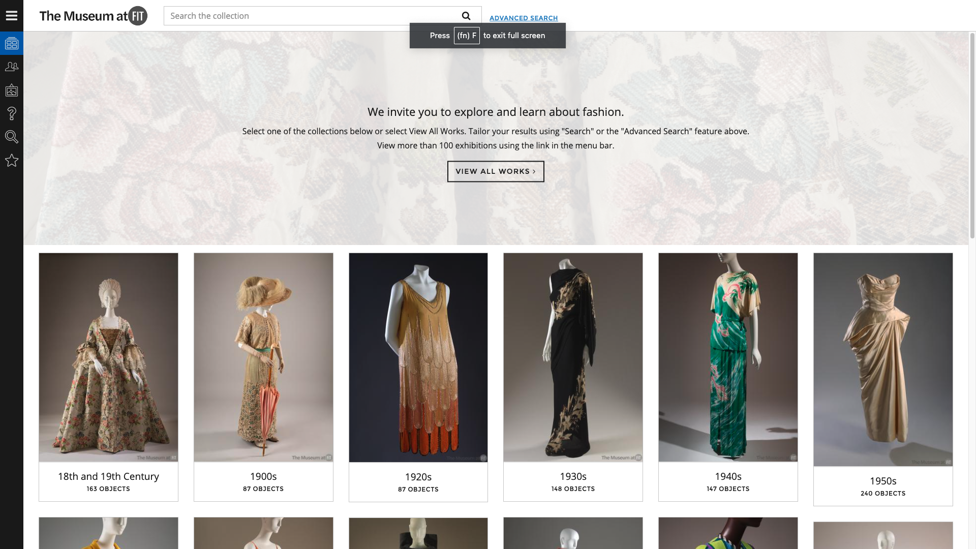
Choosing a subset such as works from the 1920s takes the user to the primary faceted search screen:
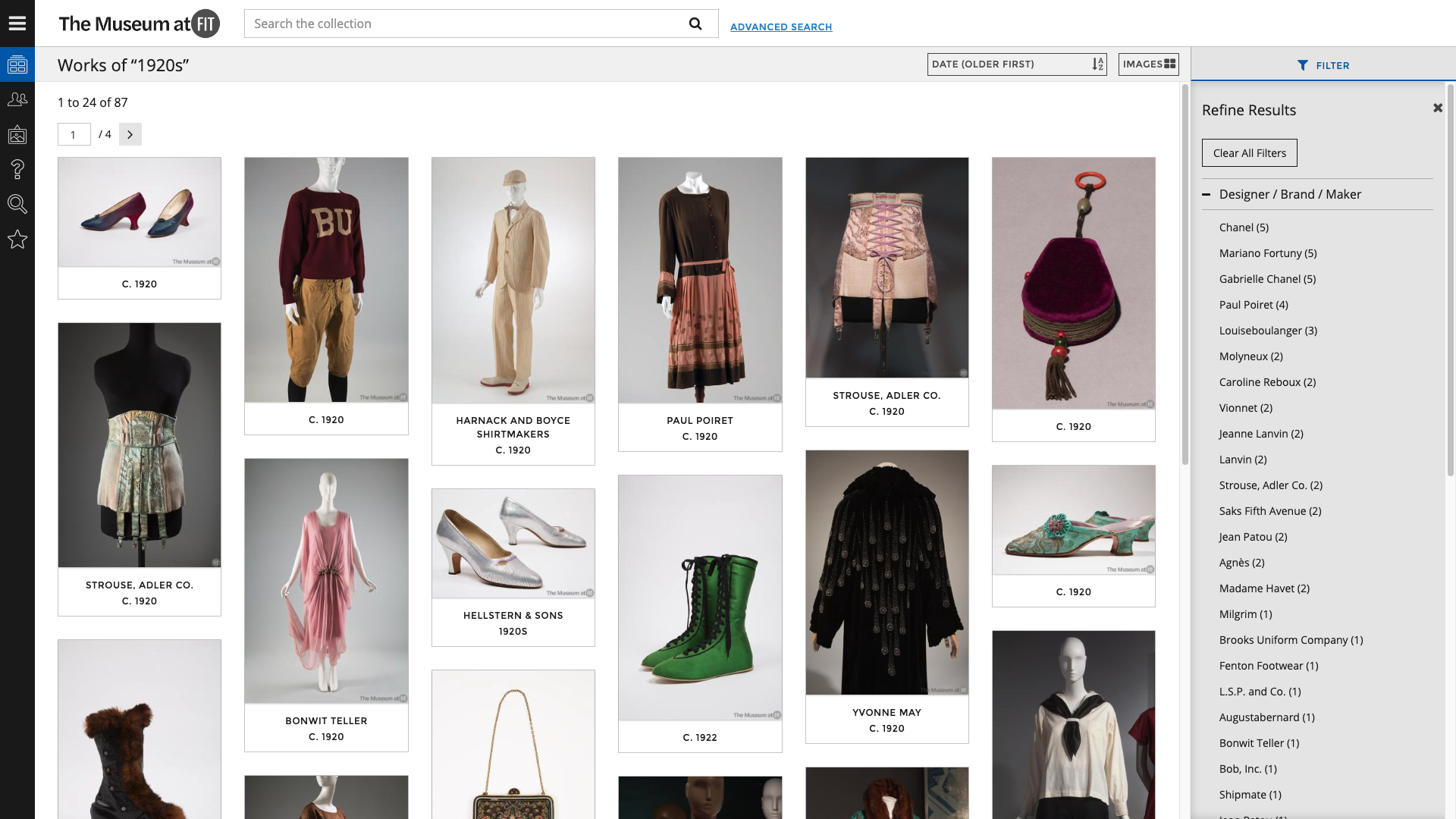
The interface is similar to the Met's faceted search, except for the way filters are displayed. In order to filter the current search results, the user must click a Filter button which pops out a sidebar (shown). The filters for fields such as Designer comprise lists of field values found in works that matched the search, with each list ordered from most to least frequent value.
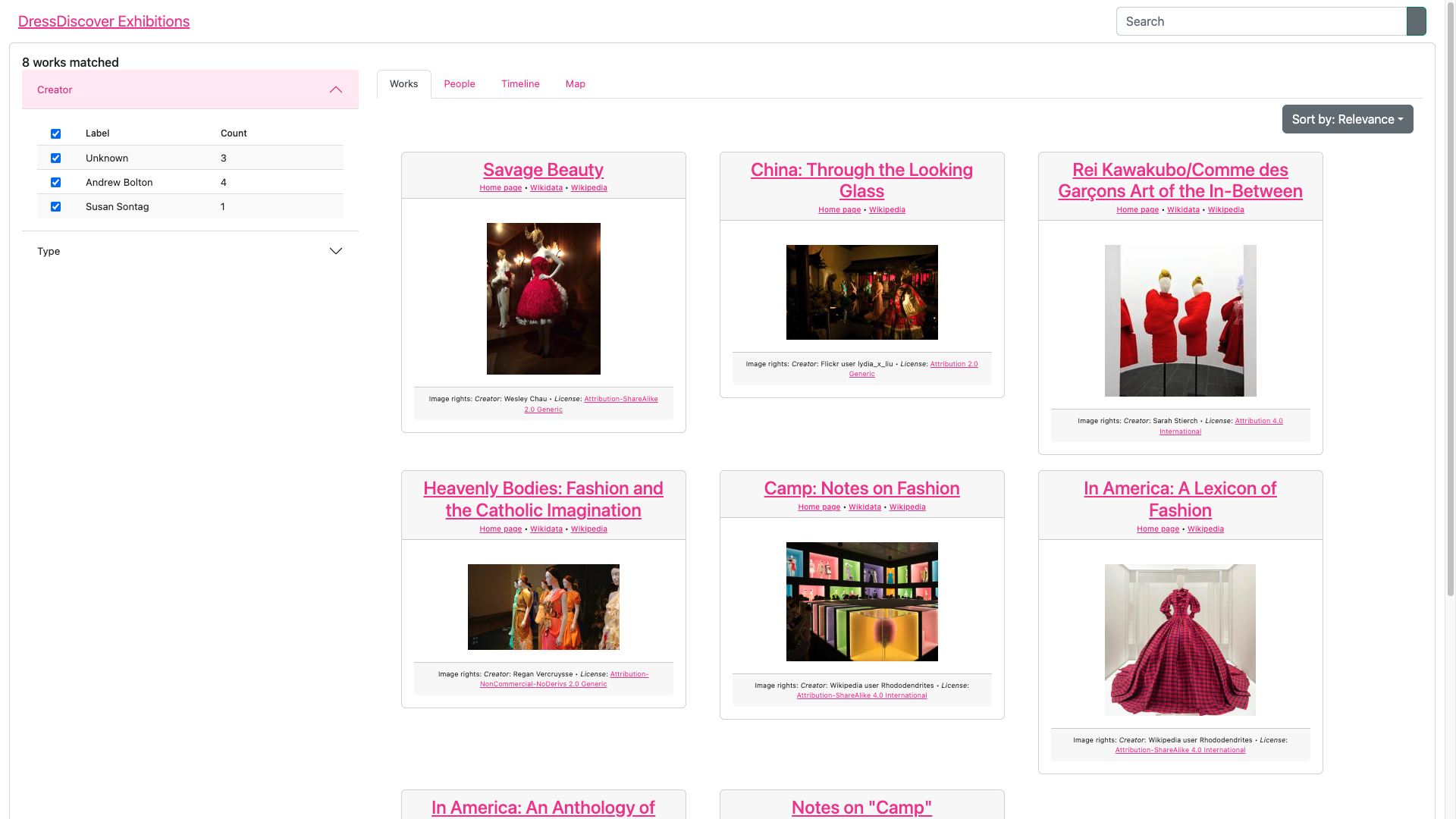
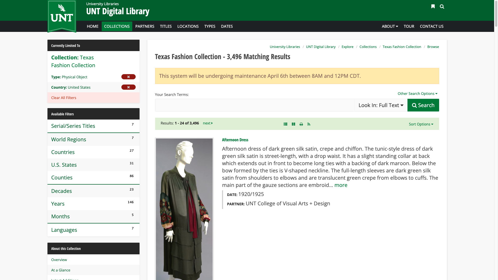
Texas Fashion Collection
The Texas Fashion Collection interface is visually distinct from those of the Met and the Museum at FIT. The default list view of the search results includes a relatively large image, the work's title, a long description, an approximate date, and provenance information.
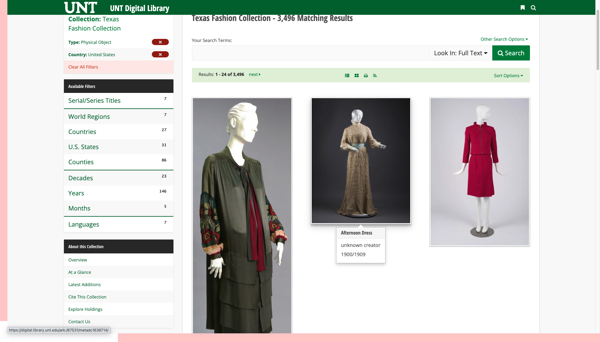
Users can select an alternative grid view, which displays large images. In the grid view the user must hover over an image to see its metadata:
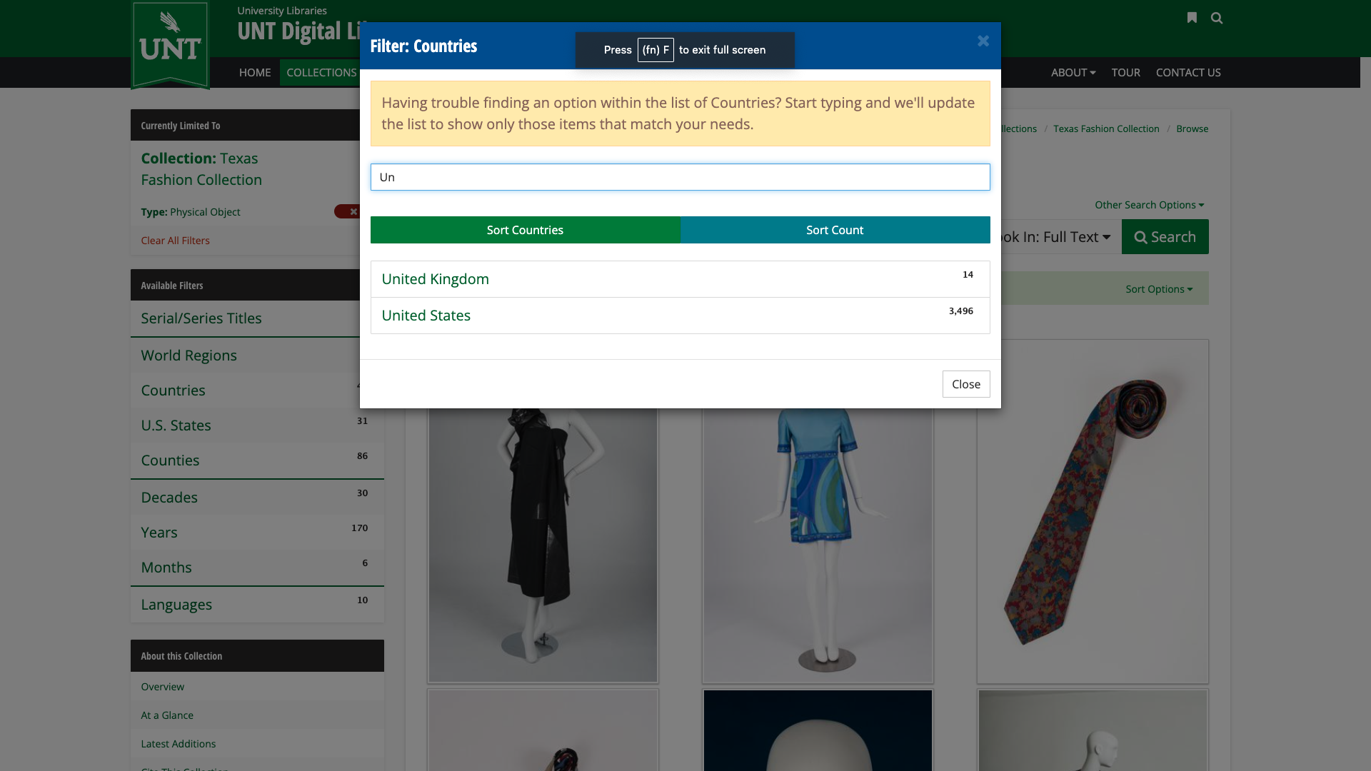
Facet filters in the Texas Fashion Collection interface are listed in a sidebar panel, but selecting a filter pops up a modal dialog that lists facet values by descending frequency:
Commercial interfaces
Companies such as Airbnb that rely on the user experience of their websites to drive revenue set the standard for faceted search interfaces.

The most important filters -- time range, number of guests, and listing category -- are given space at the top of the page. The filter for listing categories such as Beachfront and Mansions is an attractive ribbon of icons. Others filters can be accessed by clicking on the Filters button, which pops up a modal dialog:

Unlike the digital collection interfaces, Airbnb customizes the filters on a per-field basis. There are range filters (price), value filters (bedrooms), checkboxes (Type of place), and so on.
Improvements
Compared to the faceted search interfaces of the Met, the Museum at FIT, and the Texas Fashion Collection -- which have similar functionality -- the Paradicms work search app lacks polish and finesse. It looks like it was designed and built by a software engineer as an 80% solution -- because it was. Unfortunately, the remaining 20% is the difference between a clunky user interface and a good one.
We can do better. Our goal is to close the gap between the current interface and other digital collection interfaces, like the Met's. In particular, we'll focus on:
- increasing the fraction of screen real estate dedicated to the most important feature of the interface, the faceted search results
- emphasizing the most important components of each result (image, title) and de-emphasizing others
In the sections below we'll walk through improvements to the app. We won't alter the basic functionality of the faceted search interface, only how it is presented. We'll start with high-impact, low-effort changes and go from there.
Gallery card information
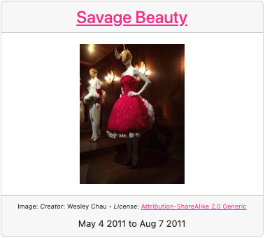
Limit gallery card information to the essentials:
- Move Wikipedia and other links out of the card headers and on to the pages for each work.
- Add an approximate date to each card as a subtitle.
Gallery card layout
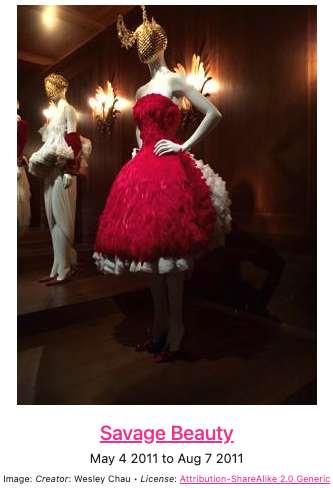
Rework the gallery card so that the most important information is the most prominent:
- From top to bottom, display the thumbnail, title, then subtitle.
- Use larger thumbnails, 400x400 max instead of 200x200 max.
- Make the card
max-widthonly as wide as the imagemax-width.

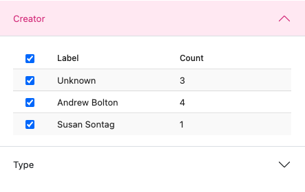
Compact filters
Make each filter and the overall set of filters more compact:
- Use select boxes with autocomplete for value filters instead of tables of checkboxes.
- Separate filters with whitespace margins instead of putting the filters in an accordion.
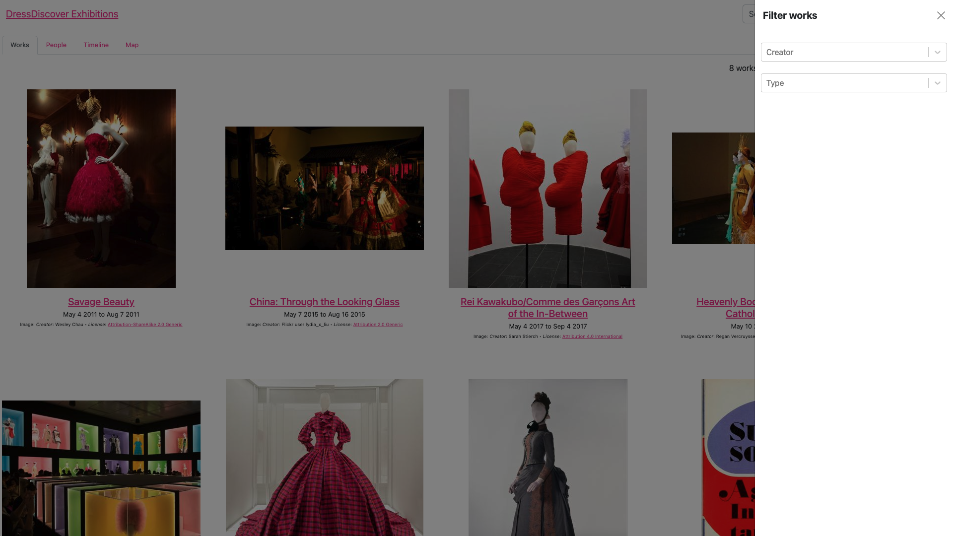
Filters in a drawer
Filters can be shown inline, as on the Texas Fashion Collection site, or in a drawer, as on the Museum at FIT's collection interface. Putting filters in a drawer seems to have become the more popular choice in recent years.

Conclusion
The improved Paradicms work search app makes better use of the available screen real estate, emphasizes the most important information about each faceted search result, and incorporates familiar user interface idioms, all while retaining the same functionality as before.
